Metrics are only accessible for Users with Admin permissions.
Navigate to the Metrics icon in the upper left corner of your browser window.
Visualize Delivery Revenue in Month-to-Date & Year-to-Date views or click on one of the graphs to view additional time period selections (i.e. All-Time, 6 Months, etc.).
How it’s Calculated
Delivery Revenue is calculated by:
Total Delivery Revenue ÷ Rental Revenue collected on Confirmed Orders with Event Dates this year
Rental Revenue does not include Sales Tax, Delivery Fees, or other fees.
Ever wonder if you’re charging enough for delivery? Too much?
Understanding the relationship between your Rental Revenue and Delivery Revenue can be helpful when evaluating your pricing, determining where to find more profitability in your rental business and seeing your growth from year to year.
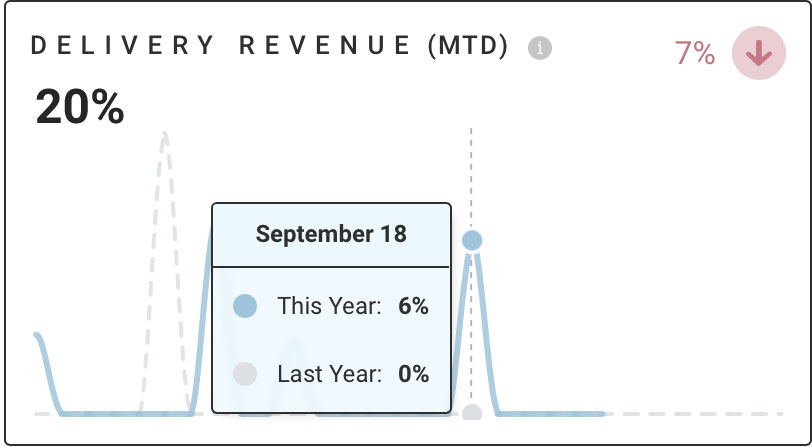
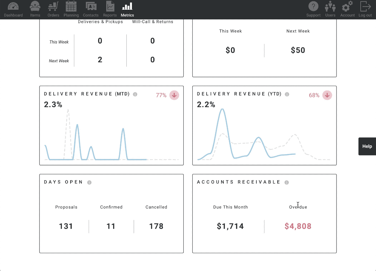
Delivery Revenue (MTD)
The Month-to-Date representation of Delivery Revenue helps you see how much money you’re collecting for Delivery Fees this month. You’ll want to keep an eye on this metric to make sure your Delivery Expenses aren’t exceeding the fees you’ve collected.
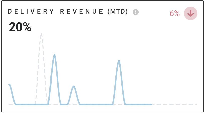
The x-axis represents time and the y-axis represents percentage value.
Hover over a data point on the graph to display specific values. For Delivery Revenue (MTD), the data point pop-up will display day of the month, this month’s values in blue, and last month’s values in gray.
The Rate of Change arrows signify the percentage change from last month to this month.
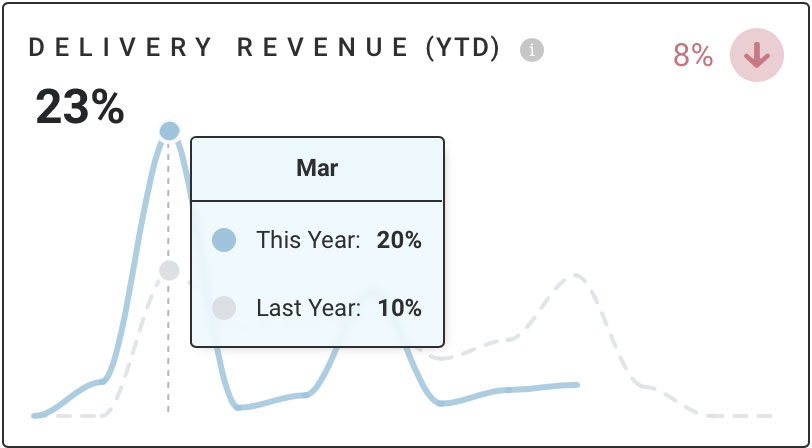
Delivery Revenue (YTD)
The Year-to-Date representation of Delivery Revenue helps you see how much money you’re collecting for Delivery Fees this year. You’ll want to keep an eye on this metric to make sure your Delivery Expenses aren’t exceeding the fees you’ve collected.
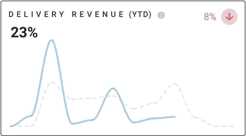
The x-axis represents time and the y-axis represents percentage value.
Hover over a data point on the graph to display specific values. For Delivery Revenue (YTD), the data point pop-up will display month, this year’s values in blue, and last year’s values in gray.
The Rate of Change arrows signify the percentage change from last year to this year.
Additional Time View Selections
To view more trends for Delivery Revenue, click anywhere within the graph to open additional time period selections.
When the new page opens, view Delivery Revenue over All-Time, Year-to-Date, 1 Year, & 6 Months by selecting one of the time ranges in the upper right corner of the graph.
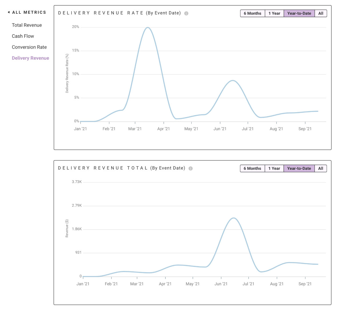
To zoom into a specific section of the graph, click on the left side of the area you’d like to view and drag the cursor to the right. This will zoom in to the selected section.
Select “ALL METRICS” in the upper left corner to navigate back to Metrics.
How Delivery Fees Are Determined
The Delivery Revenue Metric is calculated using only Items that live in the “Delivery” category.
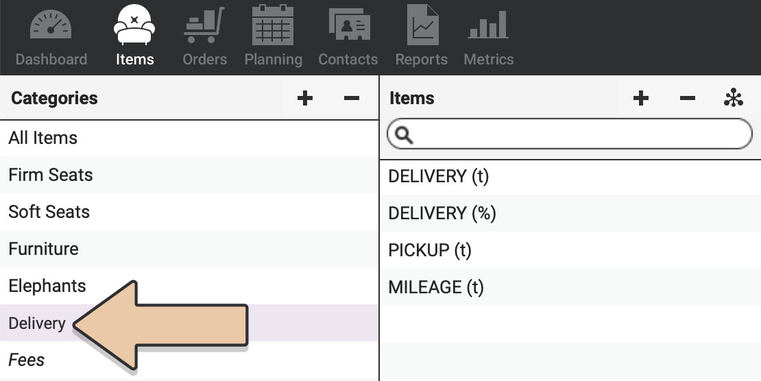
If you don’t already have a “Delivery” Category, you’ll first need to create this category within Items.
Once created, add your Delivery Fee Items to this category.
Only Items in the “Delivery” category will be used to calculate Delivery Fees in this metric.
Also check out the Delivery Fees Metric.